body {background:#dd8fff}Visual repositioning of the magazine, seeking an honest, cohesive design strategy under a new banner:
Bold Aggressive Journalism.
![]() Core Ideas:
Core Ideas:
Irreverence for the imagePart ideological, part practical—there’s an effort to offload the burden of visual identity from the image through aggressive graphics—effects, strokes, etc.—and the use of stock/open-source imagery and haphazard collage. This provides an affordance for increasingly limited production resources (especially on the web), while providing new contraints in which to operate more intentionally and efficiently—and in better keeping with scrappy, irreverant ethos of the magazine.Sharpness of voiceThe visual vocabulary is built around the notion of confident exactitude. Coupled with the philosophy of imagery, the magazine is feisty—even annoying.MaterialityThe design aim of the printed magazine, published bimonthly, is a heightened sense and awareness of its own materiality. Consistent use of metallic ink, persistent margins, harsh division between advertising and content all seek to objectify the printed book.![]()
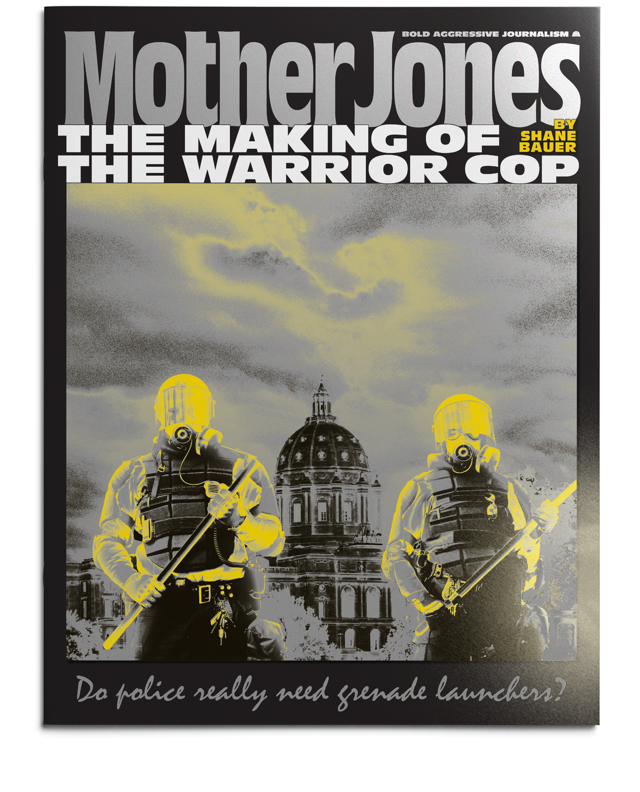
![]() Custom logotypeBased on Roger Excoffon’s Antique Olive (vital foundation of the entire redesign). The icon that accompanies the new slogan is a mining helmet, in reference to the early work of Mary Harris Jones with mine worker’s unions—also an analogy for the rigorous investigative work of the magazine.
Custom logotypeBased on Roger Excoffon’s Antique Olive (vital foundation of the entire redesign). The icon that accompanies the new slogan is a mining helmet, in reference to the early work of Mary Harris Jones with mine worker’s unions—also an analogy for the rigorous investigative work of the magazine.
![]()
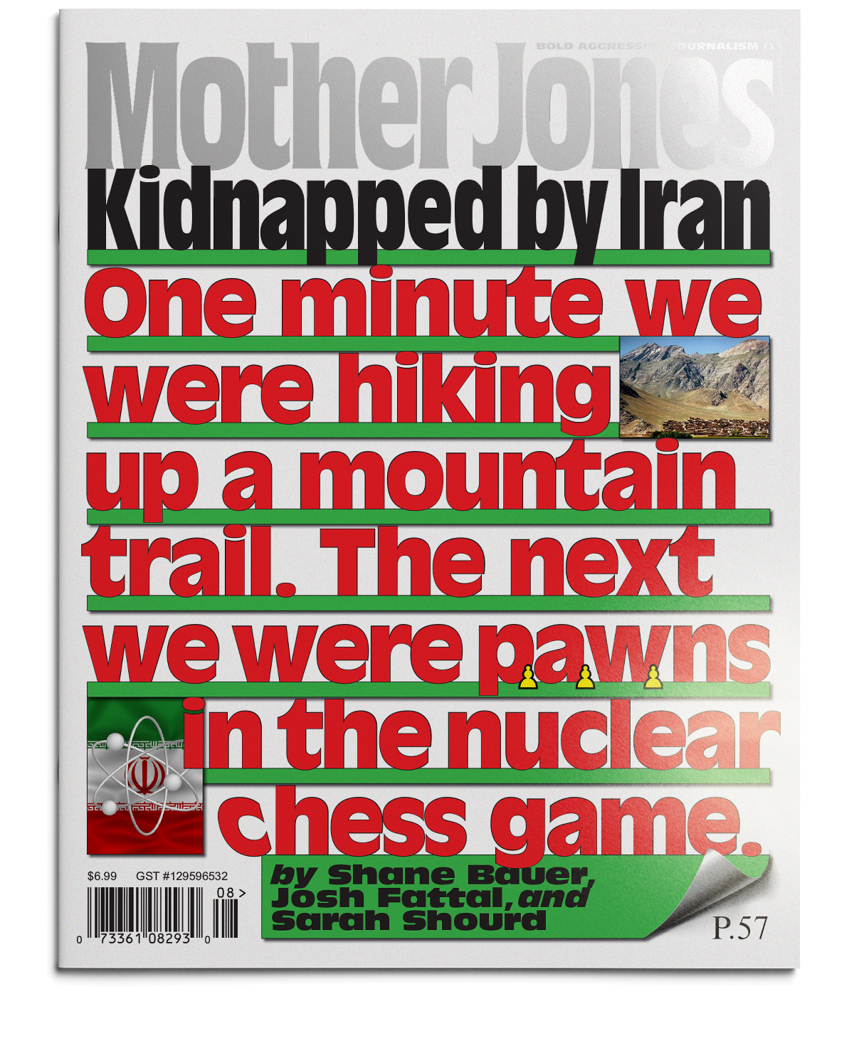
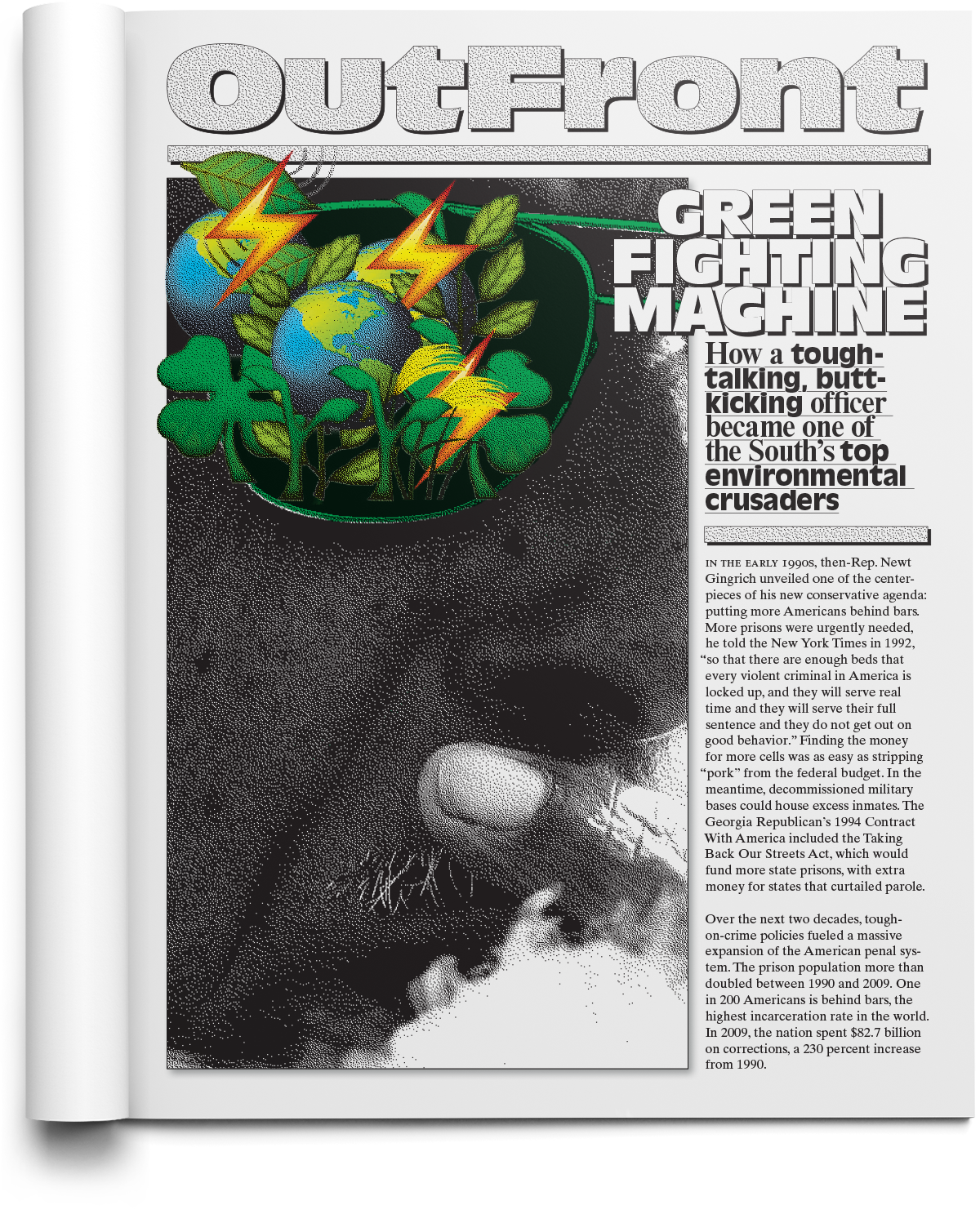
Cover story treatment exampleAbandoning the common practice of visual discord between the cover and its inside feature![]()
![]()
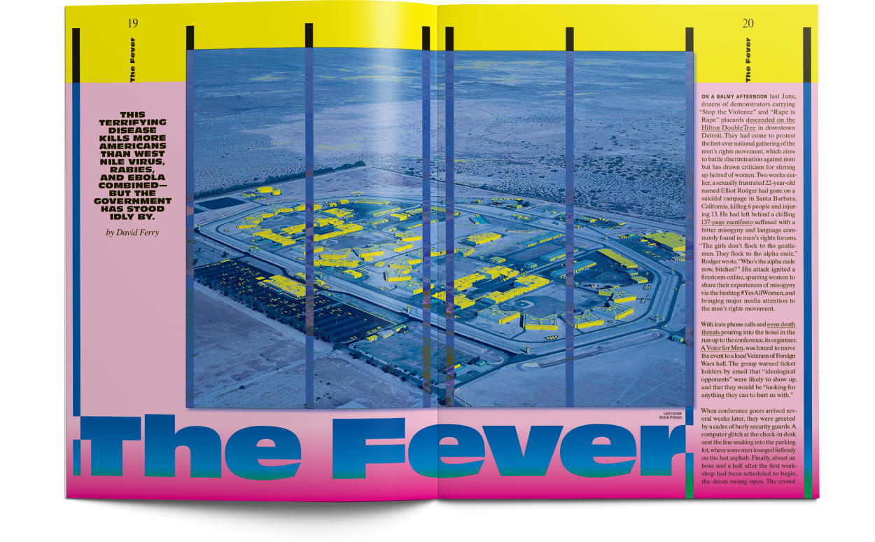
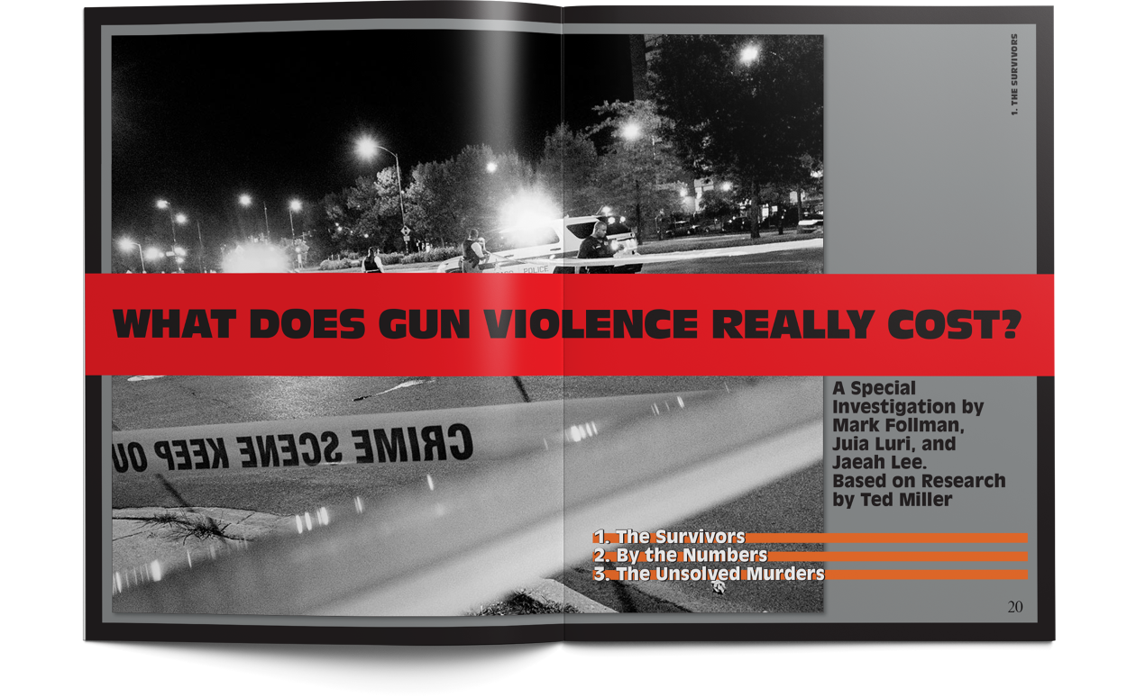
Cover story treatment exampleMany important stories are a challenge to art effectively, and this paradigm of irreverant collage hopes to engage more honestly in this area, providing the constant option to quickly and easily constuct visual spaces that invite curiosity without forcing tangetial language onto the text.![]() This feature opener recycles art from the cover, and demonstrates the use of margin annotations that include shortened URLs (to documents referenced, etc.), locator maps, and other footnote materials.
This feature opener recycles art from the cover, and demonstrates the use of margin annotations that include shortened URLs (to documents referenced, etc.), locator maps, and other footnote materials.![]()
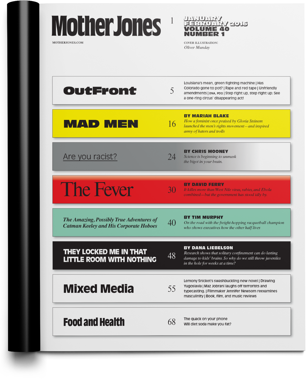
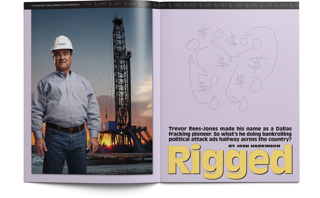
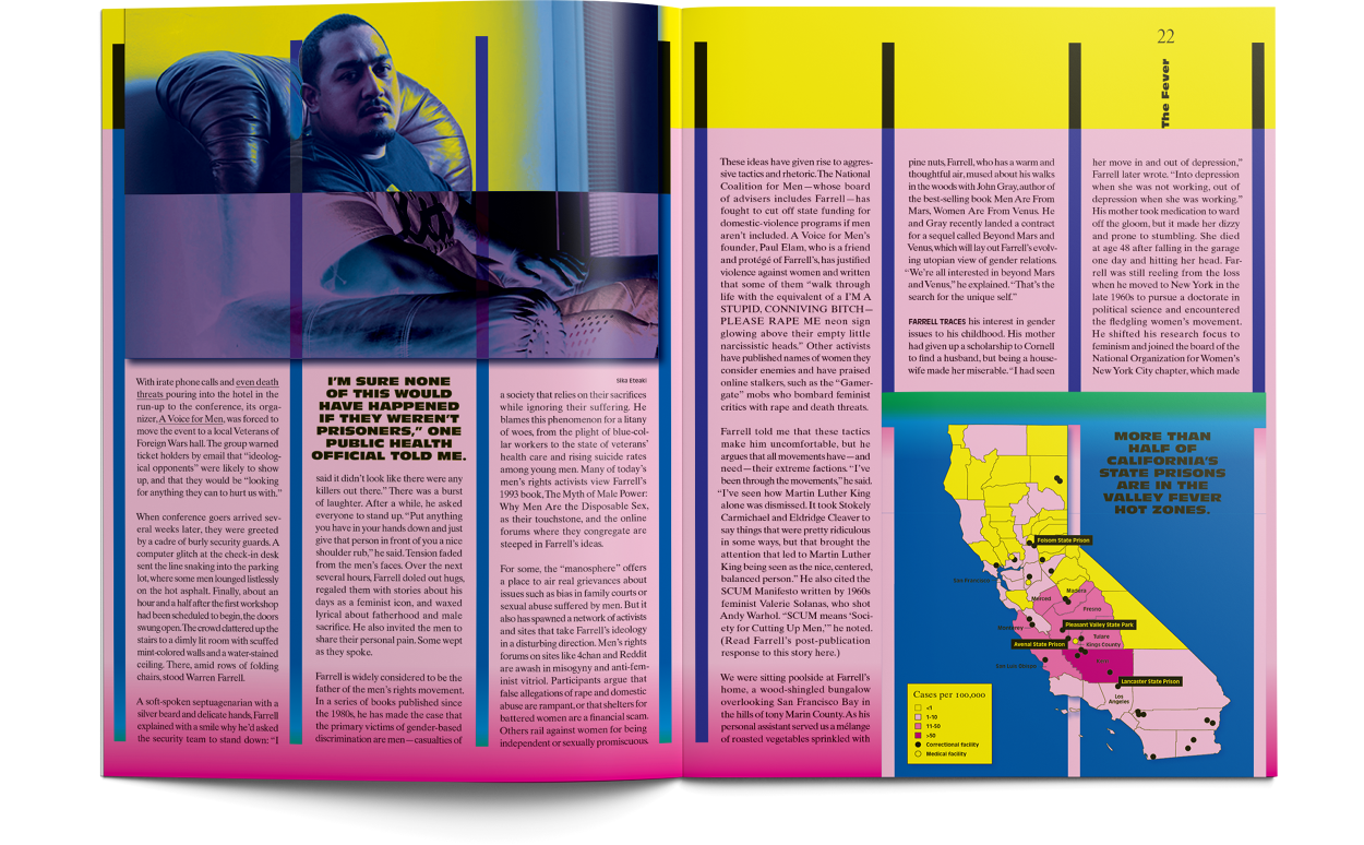
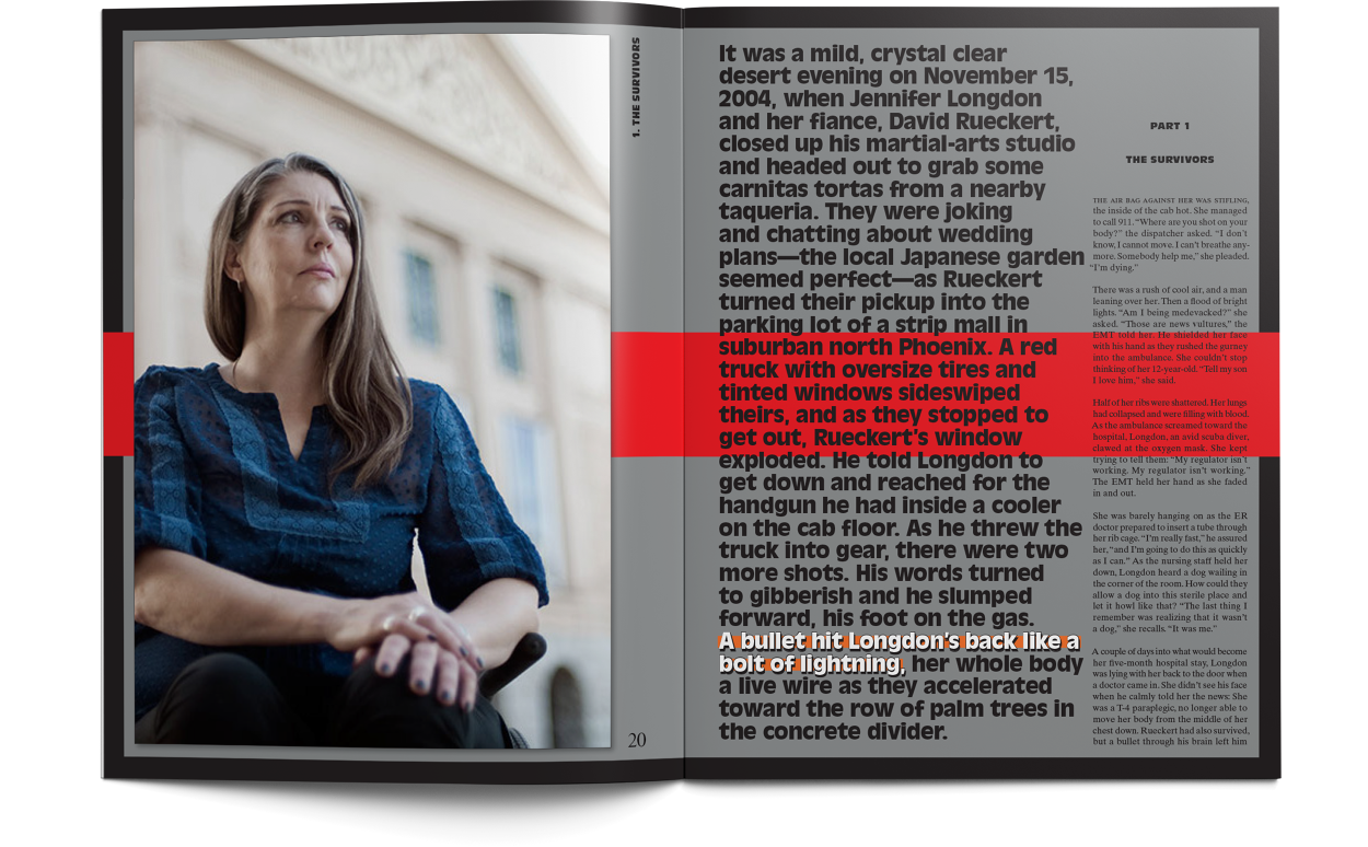
Feature brandingStructurally the magazine is comprised mostly of several long-form feature stories, and this strategy seeks to embrace that, creating section-like identities around each feature, and integrating navigational cues that enforce those “sub-brands.” Headline treatments serve as a wordmarks or logos which are represented in the Table of Contents and distributed throughout their stories to serve as a navigational markers alongside page numbers.![]()
![]()
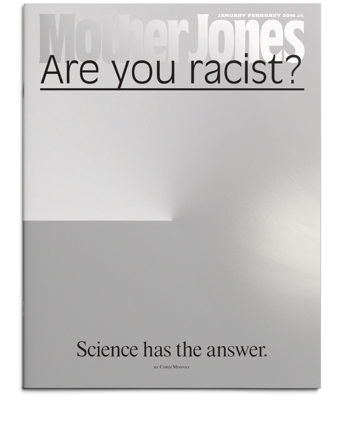
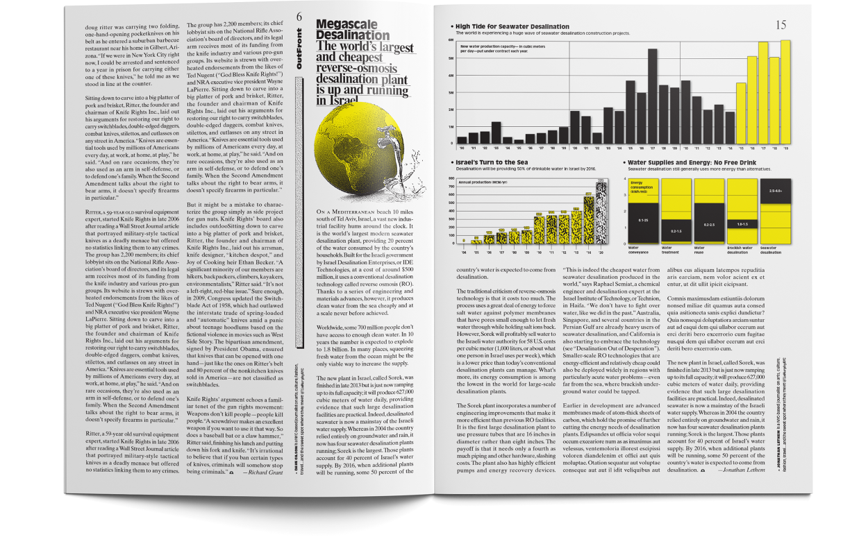
Front- and back-of-bookAll-white sections, distinct from the ink-heavy, graphic feature stories the dominate the book. The art is deliberately low-fi to force coherance, and relieve production.![]()
![]()
![]()
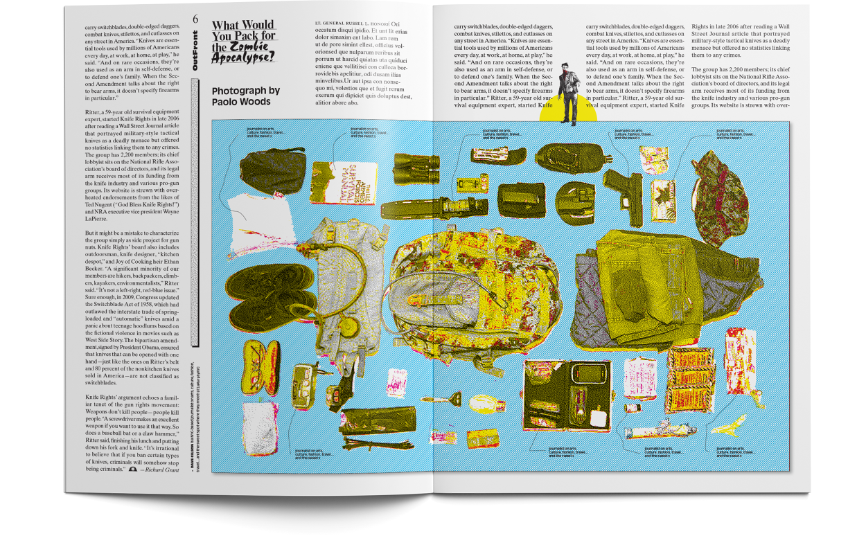
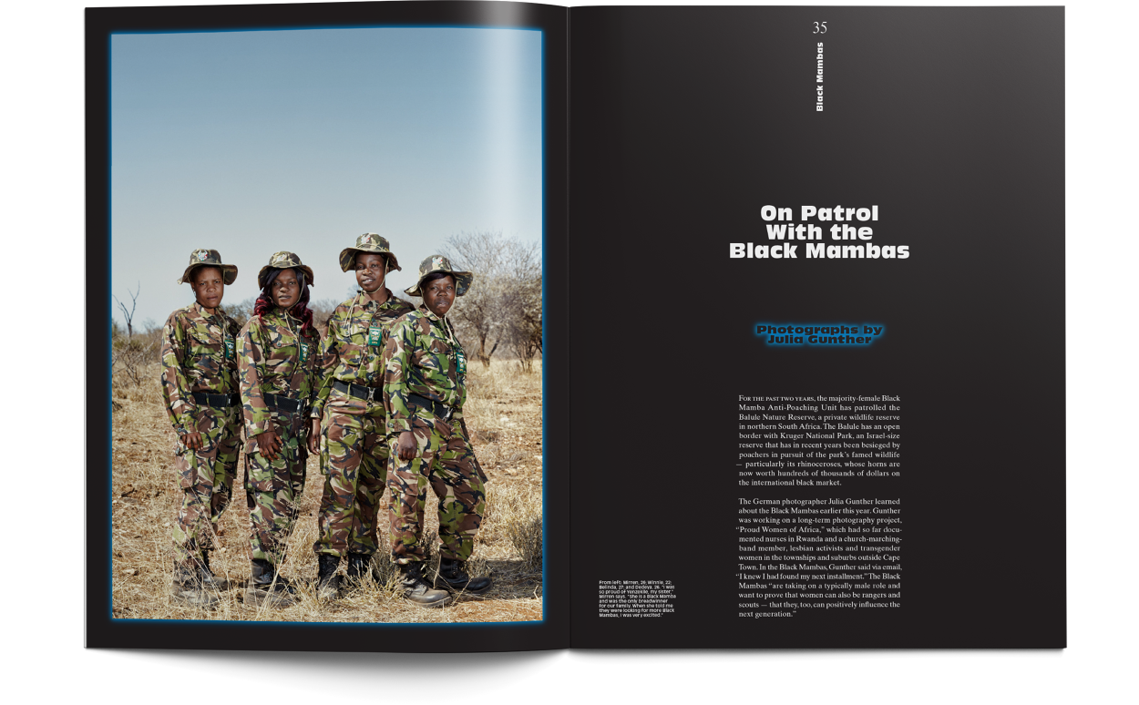
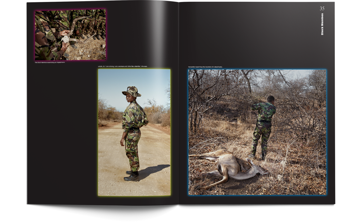
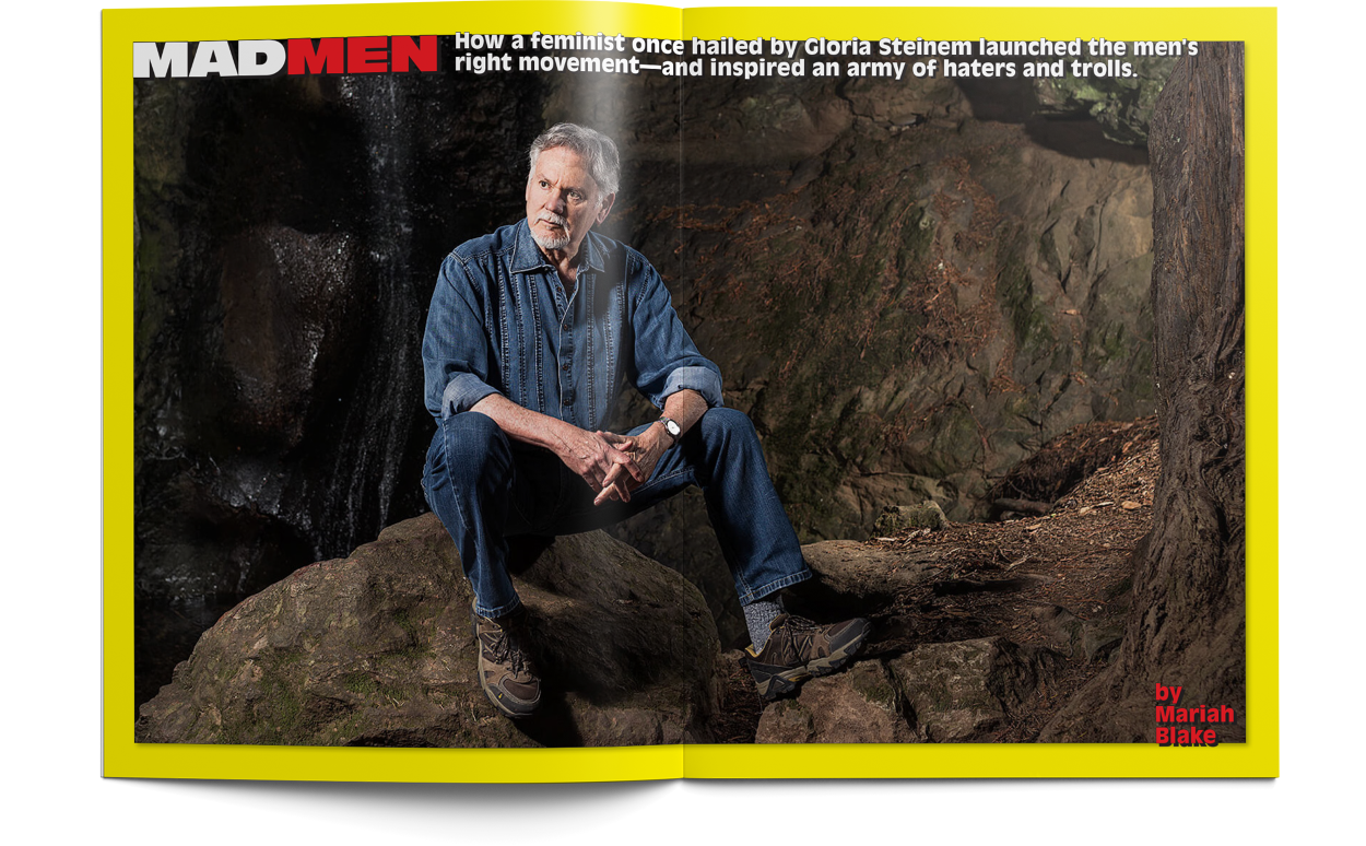
FeaturesStories are presented in visually distinctive, simple ways, each with its own rigid logic and lattice-like structure that the rest of its pages are built on.![]()
![]()
![]()
![]()
![]()
![]()
![]()
![]()
![]()
Bold Aggressive Journalism.
 Core Ideas:
Irreverence for the imagePart ideological, part practical—there’s an effort to offload the burden of visual identity from the image through aggressive graphics—effects, strokes, etc.—and the use of stock/open-source imagery and haphazard collage. This provides an affordance for increasingly limited production resources (especially on the web), while providing new contraints in which to operate more intentionally and efficiently—and in better keeping with scrappy, irreverant ethos of the magazine.Sharpness of voiceThe visual vocabulary is built around the notion of confident exactitude. Coupled with the philosophy of imagery, the magazine is feisty—even annoying.MaterialityThe design aim of the printed magazine, published bimonthly, is a heightened sense and awareness of its own materiality. Consistent use of metallic ink, persistent margins, harsh division between advertising and content all seek to objectify the printed book.
 Custom logotypeBased on Roger Excoffon’s Antique Olive (vital foundation of the entire redesign). The icon that accompanies the new slogan is a mining helmet, in reference to the early work of Mary Harris Jones with mine worker’s unions—also an analogy for the rigorous investigative work of the magazine.
Cover story treatment exampleAbandoning the common practice of visual discord between the cover and its inside feature
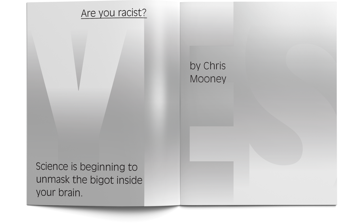
Cover story treatment exampleMany important stories are a challenge to art effectively, and this paradigm of irreverant collage hopes to engage more honestly in this area, providing the constant option to quickly and easily constuct visual spaces that invite curiosity without forcing tangetial language onto the text.
 This feature opener recycles art from the cover, and demonstrates the use of margin annotations that include shortened URLs (to documents referenced, etc.), locator maps, and other footnote materials.
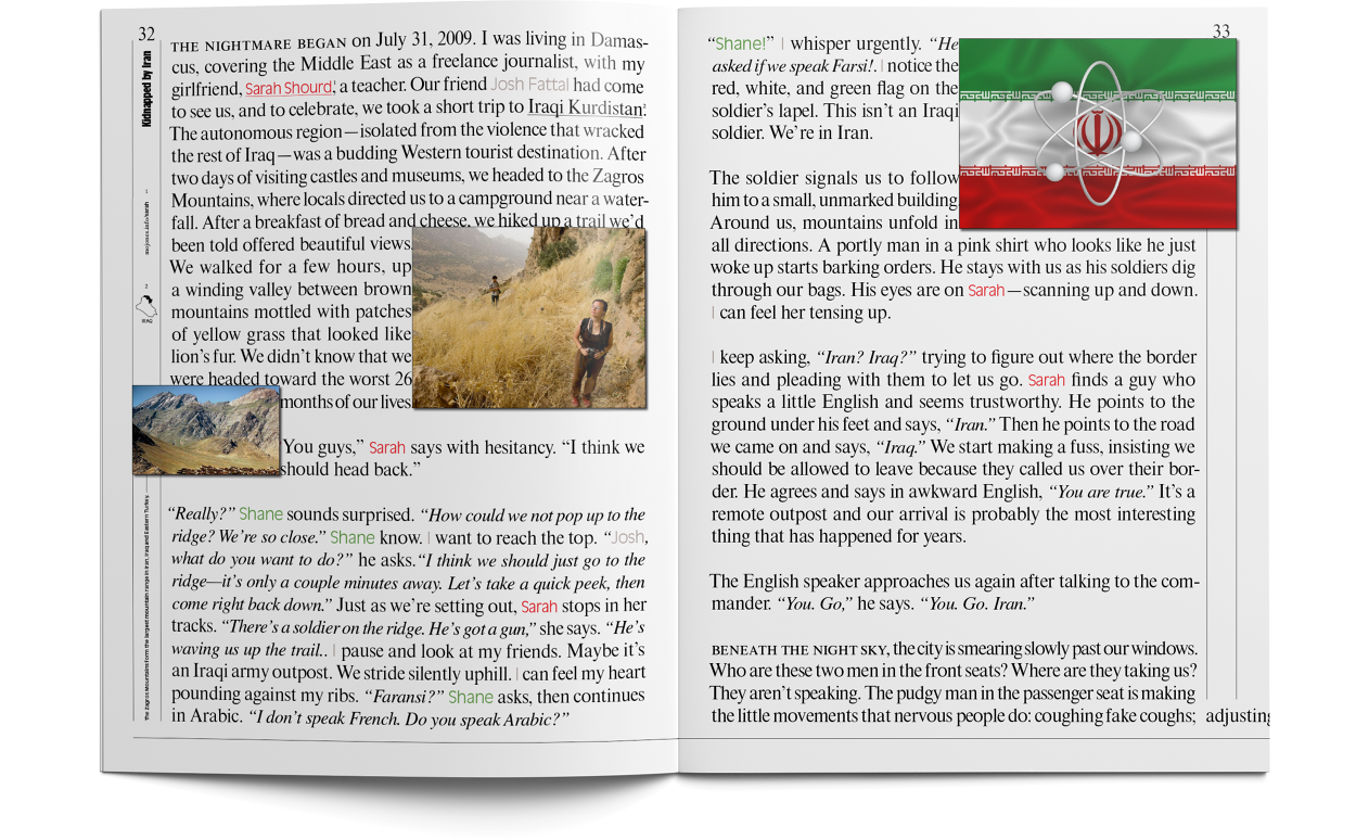
Feature brandingStructurally the magazine is comprised mostly of several long-form feature stories, and this strategy seeks to embrace that, creating section-like identities around each feature, and integrating navigational cues that enforce those “sub-brands.” Headline treatments serve as a wordmarks or logos which are represented in the Table of Contents and distributed throughout their stories to serve as a navigational markers alongside page numbers.
Front- and back-of-bookAll-white sections, distinct from the ink-heavy, graphic feature stories the dominate the book. The art is deliberately low-fi to force coherance, and relieve production.
FeaturesStories are presented in visually distinctive, simple ways, each with its own rigid logic and lattice-like structure that the rest of its pages are built on.


 art director: Larry Buchanon
 Structural cuesA new system of rules, decorative typographic markers, and headline hierarchies serve as structural cues to a readership increasingly at odds with the magazine’s visual nuance.
 RestorationNew elements are derived from precedent in the magazine’s early history, embracing what Michael Beirut dubbed the “idiosyncratic conventions [that] bespoke an almost neurotic reticence.” Working with type designers Ben Kiel, William Berkson, and Nico Schweizer, all new type families are established.
 ReductionEvery effort is made to reduce the visual vocabulary down to its the tightest range possible—doing away with red and blue text—all hierarchy is accomplished in black.


 ConglomerateFleet of XCX logos for the expansive Charli universe.
 Custom phone logodrawn by Desmond Wong
 >
>


